
Editorial Design: 6islandszine

The challenge
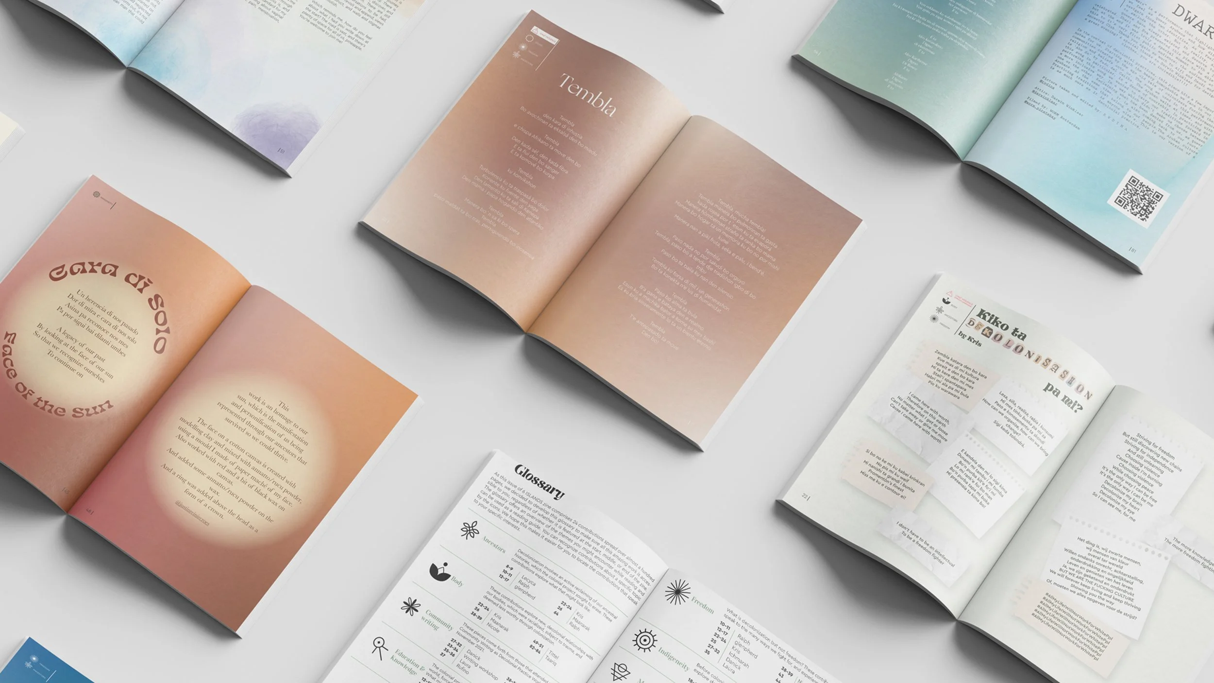
How do you create a visual structure for many different voices while giving each story the space it deserves? For its third edition, 6 ISLANDS Zine explored decolonial practices within Caribbean communities. The publication needed a visual language that could connect these perspectives while honoring their differences across both print and digital formats.
The gig
As the graphic designer, I developed the visual narrative and editorial layout for the zine. My role was to create a cohesive reading experience that supported the publication’s themes while allowing each contribution to retain its own character.
Behind the scenes
I built a visual system that helped readers navigate the zine and discover connections between its stories:
Created a set of original icons to categorize submissions according to their themes and topics.
Developed the editorial layout for both digital and printed formats.
Carefully arranged the submissions to create a considered rhythm and natural flow throughout the publication.
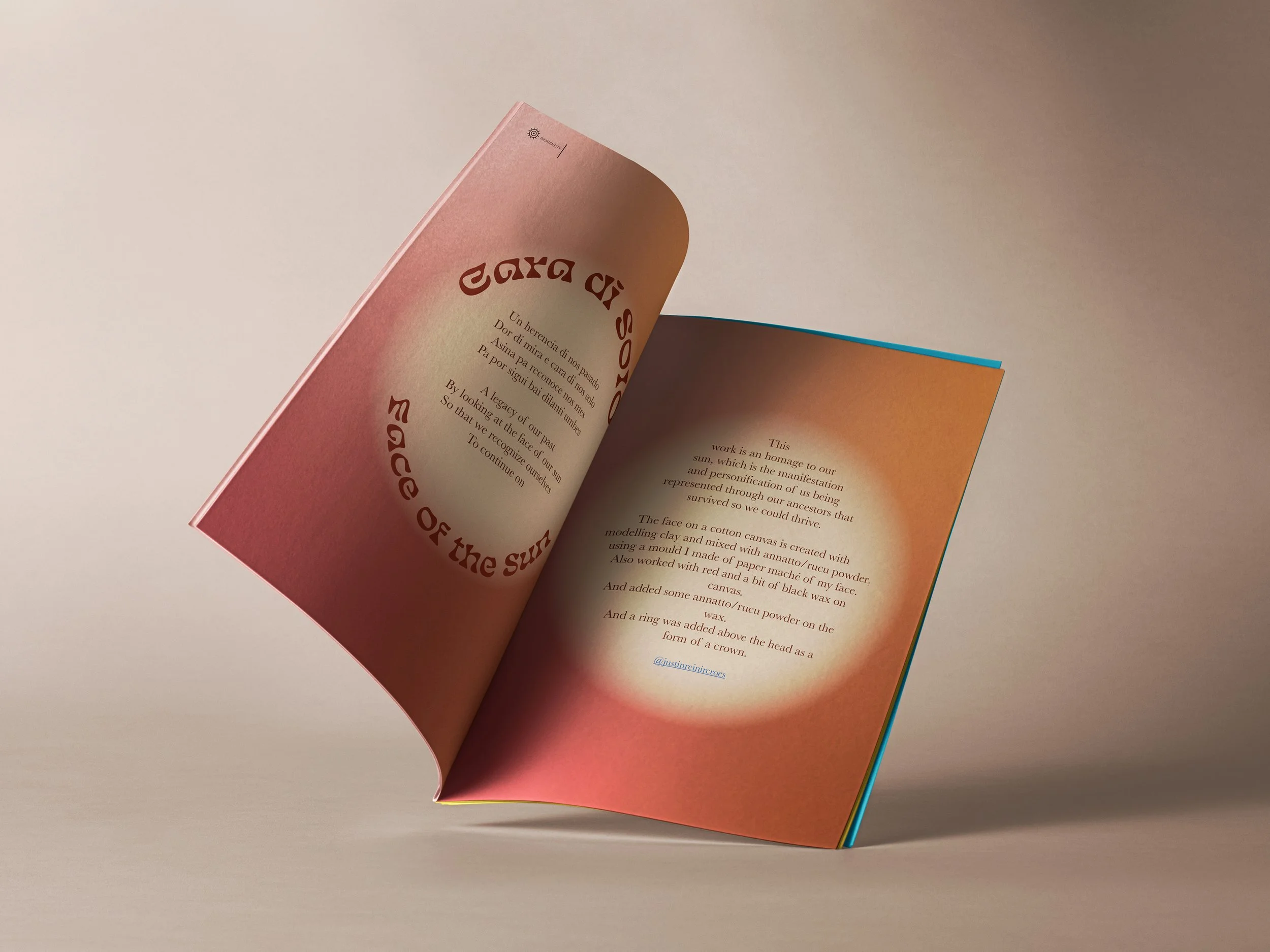
Balanced typography, imagery, spacing, and visual markers to give each story room to breathe.
Ensured that the overall design reflected the zine’s focus on Caribbean voices and decolonial practices.
The impact
The result was a zine that made room for many voices, ideas, and ways of seeing—without forcing them into the same shape. The icons helped readers find their way in, while the layout kept them curious enough to stay.