Print Design: Cocktail Posters
The challenge
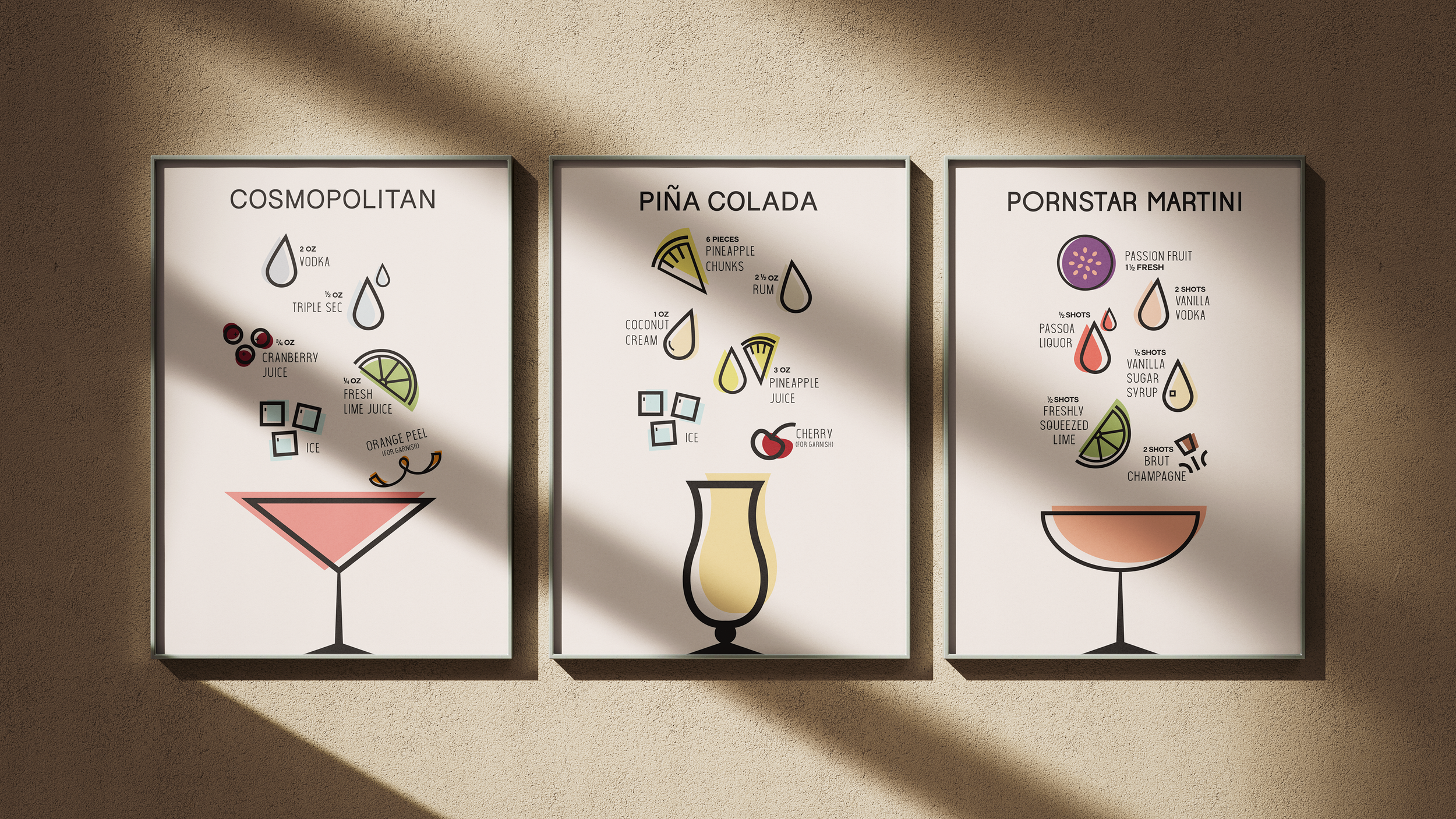
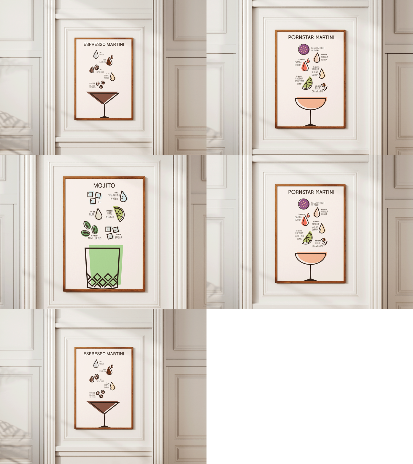
How do you turn a cocktail into a visual composition? This poster series took inspiration from the elegance of 1920s Art Deco and needed to translate the character of each drink into a bold, minimal, and contemporary design.
The gig
As the graphic designer, I developed the visual concept and created a series of posters that combined historical inspiration with a modern, minimal aesthetic.
Behind the scenes
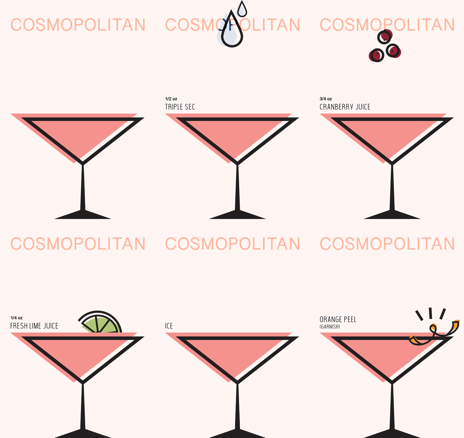
I translated each cocktail’s ingredients into a visual language of abstract shapes and carefully composed layouts:
Designed flat, minimal posters inspired by the geometric forms of Art Deco.
Created abstract shapes to represent the ingredients in each cocktail.
Composed the shapes into harmonious arrangements that reflected each drink’s character.
Balanced color, form, and negative space to create a cohesive poster series.
The impact
The result was a striking collection of cocktail posters that brought each composition to life without relying on literal imagery. The series combined the sophistication of Art Deco with a fresh, contemporary visual language—proof that sometimes a cocktail just needs the right shapes to make an impression.